Herron Todd White.
Create a memorable, effective ‘future strategy positioning visual’.
Overview
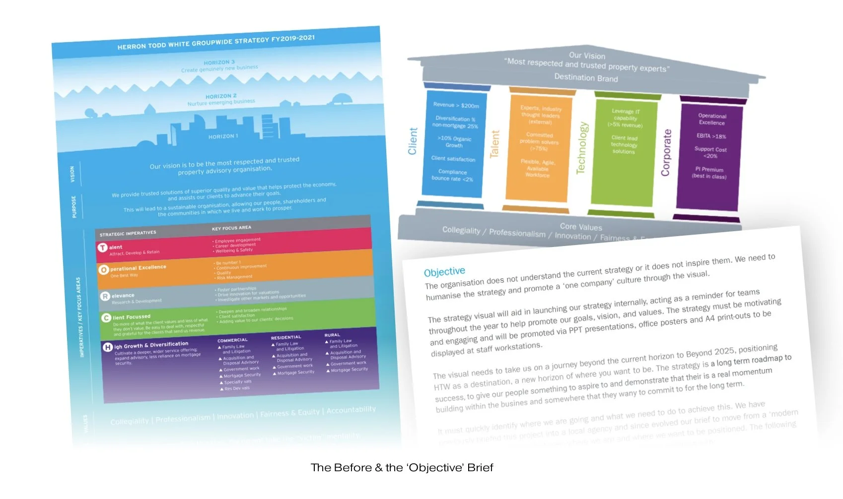
The Herron Todd White Challenge: The challenge was to make Herron Todd White's future strategy more accessible, engaging and inspiring for employees. The existing approach wasn't connecting with people or creating a shared sense of direction. Working with Belong Creative on this one. They got me onboard to solve a very tricky brief for their client.
Cue… Creative Hedge: The brief (in my opinion) was missing the mark, asking the wrong questions if you like. The client wanted a pre-prescribed solution, a graphic document - generic in nature - that contained a lot of data, detail and Word/Excel-type graphics. We wanted to get the employees excited by the Future Strategy so we needed a different solution.
Client: Herron Todd White
Disciplines: Creative Direction, Visual Identity, Internal Communications
Collaboration: Belong Creative

The objective
To transform a complex corporate strategy into a clear, engaging visual communication that employees could understand, connect with and act upon

The thinking
Taking inspiration from the bold, accessible visual language of festivals, exhibitions and fairs, we explored how simplified graphics, strong typography and memorable visual cues could bring the strategy to life.


The solution
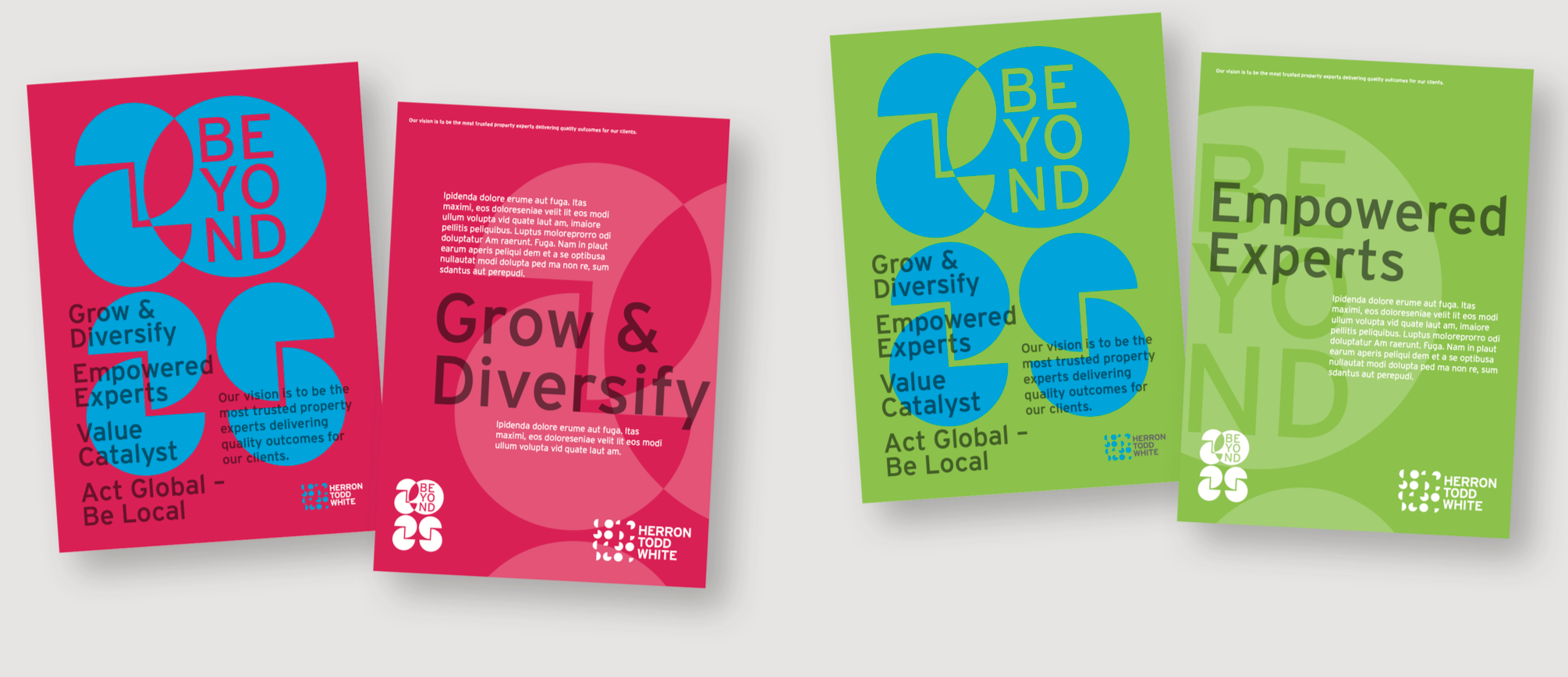
Using the circular elements of the HTW logo, the ‘2025’ graphic was formed that gave it a more on-brand feel. With the new ‘hero graphic’ for the campaign in place, I set out to extend this with typography and colour to cover various levels of engagement and inspire employees to take note and ‘get on board’ with the company strategy.



Results
The result was a distinctive visual identity for the strategy – simple, recognisable and unmistakably Herron Todd White. A graphic rallying point designed to bring people together around a shared direction.

More Work

Work Link 01
Work Link 02