
Heffron Hawks FC – Brand extension
Rejuvenate a local football team’s brand
Art Direction | Branding | Visual Identity
Heffron Hawks F.C. have been a part of Sydney's Eastern Suburbs' local community since the 70s. Their past logos were often created using stock graphics and elements slapped together from logos of other football teams. Without (too drastically) changing the 'essence' of the club logo - the aim was to create a new, more modern emblem and extended brand for the future.

Winner of Gold in Graphis Design Annual 2022 – Branding

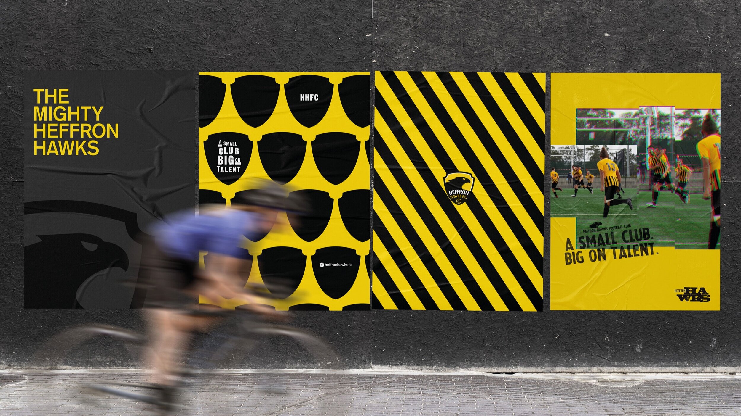


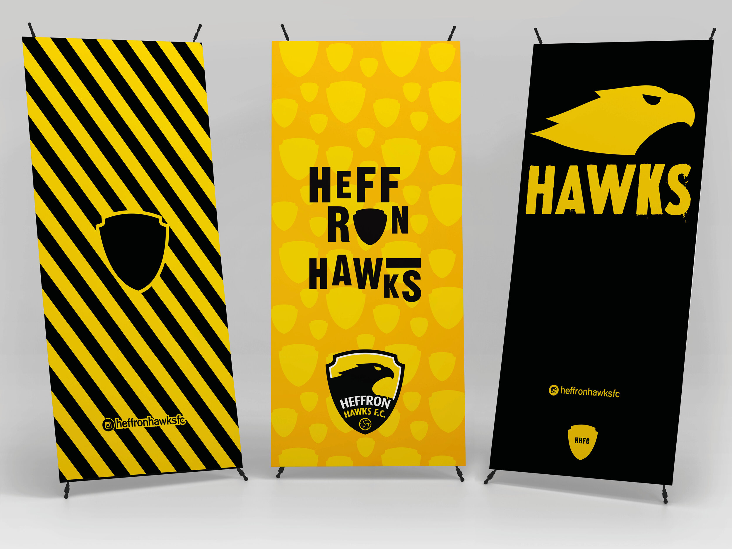
We introduced a more modern take on typography, and dynamic graphic elements and background patterns were created.
Two distinct styles were created to live alongside each other. The bold, sharp typography that lived by its own grid structure rules - often breaking the norm, creating more artistic typographic forms – and the grungy distressed print look which is used mainly for secondary logos and positioning lines